On building a better ARR reporting system
What we've learned from scaling ARR reporting at dozens of companies.
ARR reporting is hard.
I’ve found that the challenges come in two forms: defining the logic and building the reporting that sits on top of that logic.
Every company has a unique combination of product offerings, pricing models and go-to-market strategy, which is why there are so many edge cases to consider when defining ARR logic. We’ve detailed those considerations at length in our book, The Ultimate Guide to ARR, so I won’t get into all of that detail here.
But the challenge doesn’t end with defining ARR. It continues through to building reporting and surfacing insights on ARR performance. Talk to any finance leader and they’ll tell you the 100 ways they’ve attempted to standardize the process and how they’re still on a quest to perfect it.
There’s no doubt that ARR reporting is a never-ending journey. But in this post, I’ll share how we’ve templatized the process for our customers at Equals and hopefully provide some inspiration for how to do this at your company.
Flat file nirvana
At Equals, we like to say every analysis starts and ends in a spreadsheet — there’s just a messy middle step to get the data in a format where you can run your analysis.
ARR reporting is no different. The challenge is transforming invoice or subscription data into a clean dataset for calculating growth, retention, and pacing.
I refer to this output as the “ARR flat file.” This flat file should return a record for each customer, along with their ARR for every day they were active on your platform.
Once you have that, it’s easy to layer on definitions for the ARR component parts (new, expansion, contraction, churn) or firmographic data (segment, industry, acquisition channel).
This sounds easy. So what makes ARR reporting so hard?
Challenges with the ARR flat file
Here are some of the most common macro-level challenges I’ve seen to get this done.
No GAAP definition
There is no GAAP definition for ARR — and because every company has their own idiosyncrasies in go-to-market strategy and pricing, there’s an infinite number of ways to calculate ARR.
Most Finance folks don't know SQL
Most finance and ops folks are great at extracting insights and telling stories with data but they’re usually not proficient in SQL. This forces a partnership with a technical counterpart which usually leads to longer feedback cycles or details being lost in translation.
Bobby makes a great case for why every analyst should learn SQL in this post :)
The last mile problem
Getting things to 90% or 95% accurate is usually pretty straightforward. The really hard work starts from there as you get deeper into edge cases and workarounds in the logic. Unfortunately, there’s no margin for error — and no one will trust the data until it’s 100% accurate.
How we solve for these challenges
Our team has accumulated a lot of experience building these both in-house and externally for dozens of customers. These experiences have given us insight into the challenges faced by all types of companies, from startups to those with over $100M in ARR.
With each buildout, we discover a new consideration or edge case that can be applied to the next customer. What this looks like in more tangible terms is a canonical SQL transformation that incorporates all of the learnings from prior builds and is fully customizable to each business’ needs.
This approach speeds up the feedback cycle of defining ARR from several months to a few days — and solves the last mile problem.
Core ARR reporting units
Once you’ve solved the underlying logic, the next step is figuring out how to visualize the data.
This part of the exercise is equally challenging, but for a different reason. Few people will take the time to educate themselves on the intricacies of your ARR logic, but EVERYONE has an opinion on how to format a chart or table.
Getting this right means solving for different levels of granularity. How can you package the data in a clear and concise way that satisfies the high-level needs of the executive team while still providing enough detail to inform ad-hoc analysis at the analyst level?
Dashboard design principles
Our approach to ARR dashboard design revolves around two core principles.
First, the organization of the data within a dashboard should start with the highest-level insights and transition to more granular detail as users scroll down.
Second, the data across dashboards should be mutually exclusive and collectively exhaustive. This makes it very clear for users to know what dashboard to pull up to get specific questions answered.
This is a process of continuous improvement, but we’re really excited about what we’ve built.
Let’s walk through the three reporting assets we’ve templatized for our customers, all of which sit on top of the ARR flat file we covered in the prior section.
ARR Build
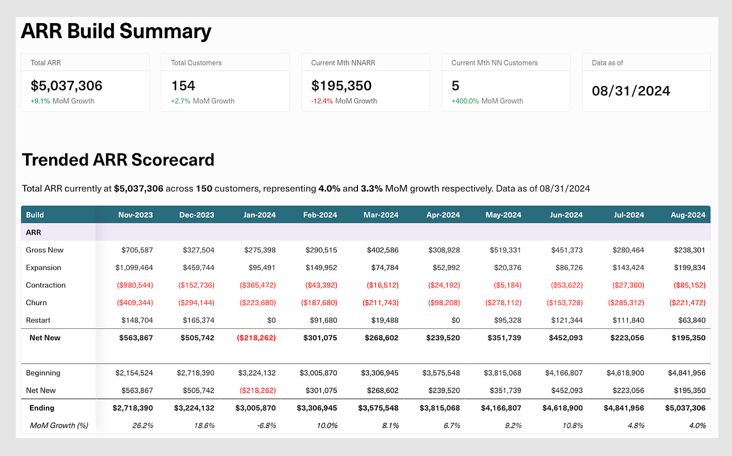
The ARR Build shows how total and net new ARR and customer volume is trending over time.
We start with a few hero metrics to make it clear where the total business stands today and then quickly move to a table breaking out the component parts of net new ARR (new, expansion, contraction and churn) that contribute to changes in the top-line number.
From there, we break out both the total business and net new component parts with a side-by-side view of ARR and total customers + ACV. This makes it really simple to see if changes in ARR came from fluctuations in customer volume or the ACV of those underlying customers, and helps with calculating key ratios like expansion rate, churn rate etc.
Total business example:
Net new component part example:
If more digging is needed, users can navigate to the underlying workbook to look at different time intervals (daily, weekly, monthly), time periods (last 12, 24 or 48 months) or filter for the specific customers contributing to the performance trends.
ARR Pacing
The inspiration behind the pacing dashboard comes from the panic we experienced working at more enterprise-led companies.
Somehow the last month, week, or even day of the quarter always contributed a huge amount to the period’s overall ARR. This made it really difficult to understand if we were ahead or behind where we should be at any given time.
To better understand this, we calculate the median daily performance build for a specific unit of time (month, quarter or year) across the entire history of the business (stripping out any outliers as needed).
The end result is a clear representation of where performance should be at any point in time, plotted against the period-to-date actuals.
Here’s an example of this view by quarter:
We can display these forecasts at whatever level of granularity is needed and can seasonally adjust the historical comparisons where necessary (only compare Q4 performance against prior Q4s).
It’s also easy to create views comparing different forecast scenarios or document forecast accuracy for prior periods.
Cohort Summary
No ARR reporting suite is complete without a cohort dashboard.
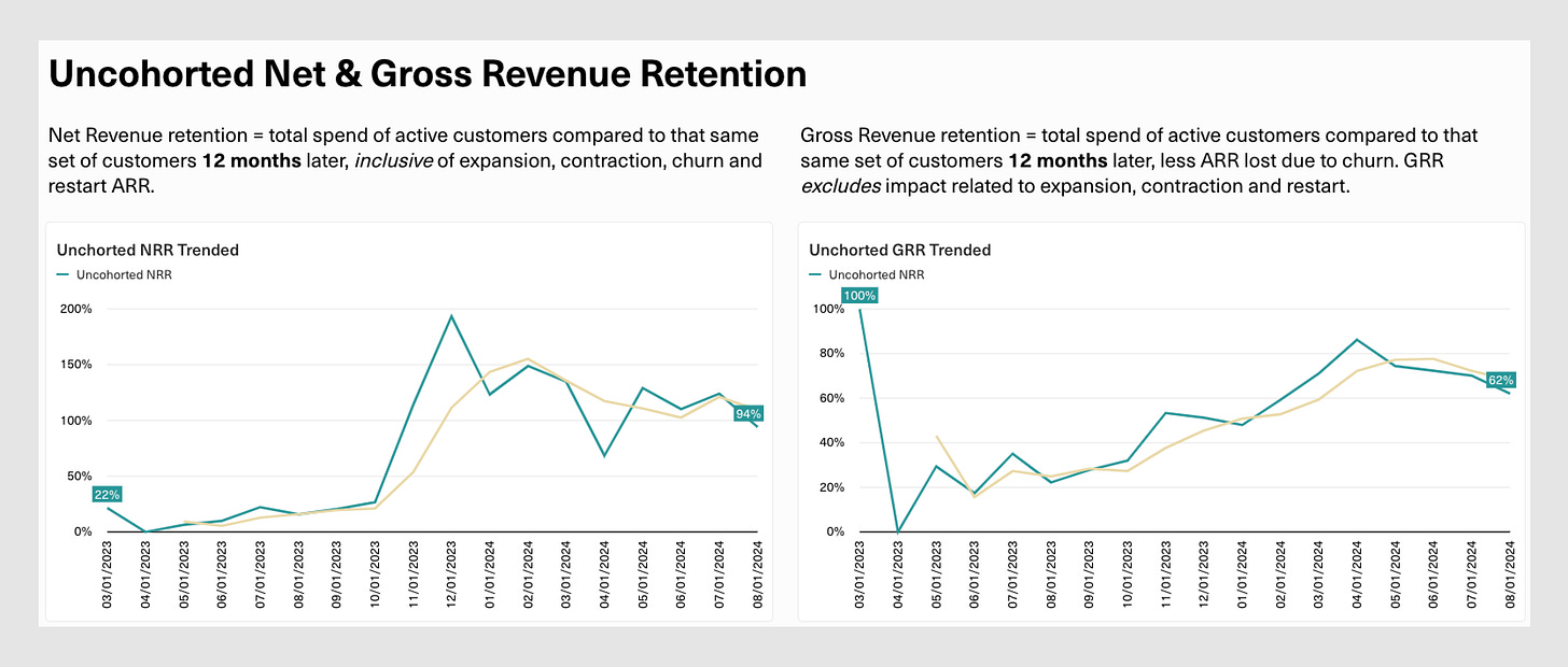
Here we have views for net and gross revenue retention on an ARR and logo basis. Similar to the ARR Build, users are able to change the inputs for the duration of each calculation (e.g 3-month NRR vs. 12-month). This makes it easier to spot performance trends ahead of time.
Here’s an example of the uncohorted views:
And another of the cohorted view:
Finally, we end with one of my favorite visualizations: ARR and customer builds cut by customer acquisition year. The inspiration came from page 68 of Slack’s S-1 filing back in 2019 and is a great way to show the power of compounding NRR.
I hope this helps you in your ARR reporting journey, preparing you to better run your company, forecast your business, and impress your investors.
If you have any questions on what we’ve built or need someone to brainstorm with, please reach out to me at chris@equals.com!


