Five must-have views for every SaaS company
Running an early-stage, venture-backed startup is challenging. Trust me, I'm there. These are the key metrics and reports you need to fly the plane (as you build it).
As a founder of an early-stage startup, at any given point, you might be trying to…
successfully onboard customers…
learn from customers who churn…
build and launch your latest feature…
manage employee morale…
hire the right people…
establish your culture…
articulate a clear vision to the company…
make space for yourself to be creative and come up with new ideas...
optimize (or fix) pricing and packaging…
file company taxes…
not get sued…
build out your marketing site…
figure out sales quotas…
fundraise…
run board meetings…
keep investors happy. 😅
It’s relentless. The sheer magnitude of things happening all at once is daunting and overwhelming. How on earth does one manage all of this without losing it?
This post is inspired by the introduction of our newest offering – Equals Experts.
A team of analytics pros on deck to help with model building and implementation.
Putting structure around the chaos
In my experience, it helps to put structure around the chaos. And structure, for me, comes best in the form of metrics and instrumentation. They help me to understand and articulate where we’re at as a company – to diagnose what’s not working and to clearly see where we should double down.
Like the control panel of an aeroplane, metrics give me a constant pulse on where we’re at, minimizing the chance of disaster and maximizing the probability of getting to our destination.
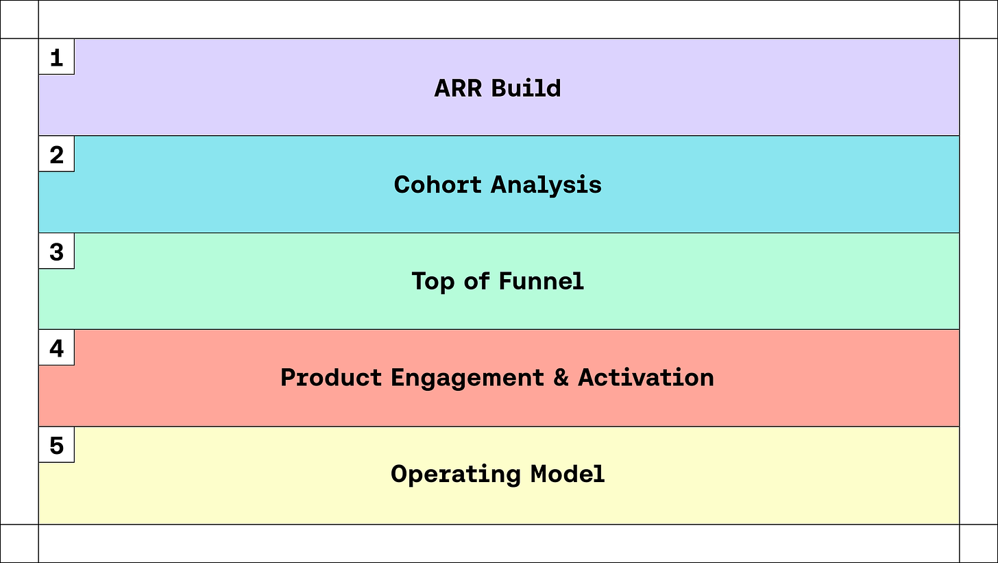
For SaaS companies, I’ve found that there are only a handful of key views you need to fly your plane.
1. ARR Build
The Annual Recurring Revenue (ARR) Build is the first report I built when I started as Intercom's Head of Finance and Analytics. It’s the most powerful framework by which to look at your business.
Recurring revenue is the lifeblood of SaaS. Defined as the amount of revenue that’s under contract or set to renew on an annualized basis, if you sell your product month-to-month, then it’s how much you billed in any given month, multiplied by 12. If your customers sign annual commitments, ARR is the sum of revenue under contract at any given point.
Most ARR reporting tries to get us our overall ARR trajectory. For example, when you look at your Stripe Dashboard, you’ll get an aggregated summary of ARR over time. Simple. Helpful. But oftentimes not actionable. What levers do we have from here to grow our ARR?
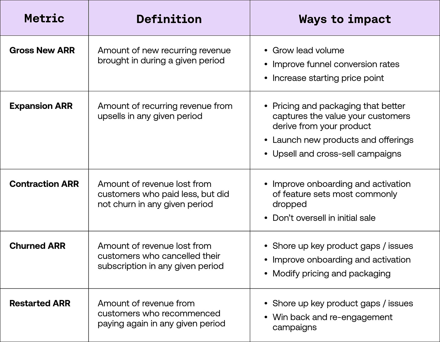
That’s why I like the ARR Build so much. It tells the story of how your revenue is made up. It’s constructed of 5 elements, each showing a critical component of ARR in a format against which you can act:
From here, the equation for your business becomes pretty simple:
Armed with your ARR Build, you can now tell the story of your ARR between two periods. Personally, I like to monitor the build monthly using ratios that tell you whether you’re getting better or worse at impacting each of its component parts.
From here, you can also use the ARR Build to construct forecasts and targets and closely monitor your performance.
2. Cohort Analysis
The next most important analysis to build is your retention cohorts. While an ARR Build helps tell the story of how ARR came to be between two time periods, retention cohorts allow you to understand the story and health of a specific group of customers longitudinally and give you a framework to compare “cohorts” of customers.
I like to view cohorts in two ways. Here are the key differences in the approaches:
a. Left-adjusted cohorts
With left-adjusted cohorts, our columns compare like-periods. So, in the example below, we’re looking at revenue for a specific cohort that made it through their 1st billing, 2nd billing, 3rd billing, etc.
From here, we can look through a column, identify our average retention after 1, 3, and 6 billing cycles, respectively, and see if it’s improving or worsening.
We can also more easily identify break-points across cohorts. For example, in the example data above, we can see that cohorts started performing meaningfully different in July of 2022. It looks like we changed how we onboard folks so that they’re retaining and expanding significantly better. Great.
b. Right-adjusted cohorts
In a right-adjusted cohort view, the columns represent a fixed moment in time. The benefit of building cohorts this way is that you can sum a column and get the total revenue for that period. For example, if all of our cohorts were in the view below, we could calculate October 2022 revenue by summing up the revenue in the last column. This becomes a powerful way to forecast.
The other benefit of right-adjusted cohorts is that they allow you to spot changes that happen across the entirety of your business more easily — changes that impact ALL cohorts. For example, above, we can see that something happened in August 2022 that looks to have impacted all cohorts - perhaps a competitor released a new product that caused churn across the entire customer base.
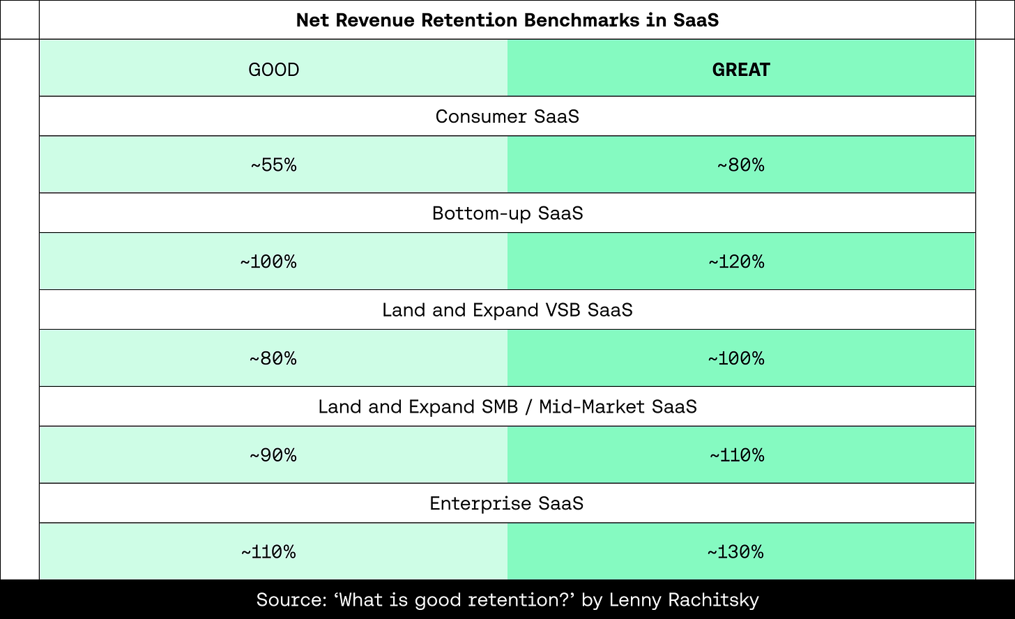
What is good and great retention?
Benchmarking retention highly depends on the type of SaaS business you run - your price point, who you sell to, and how you sell. The best resource I’ve come across was in Lenny’s Newsletter, where he broke down good and great net revenue retention by category.
3. Top of Funnel (ToF)
Now that we understand how revenue comes to be (thanks to the ARR Build) and the health of any cohort (thanks to Cohort Analysis), we need a framework for acquiring customers. Commonly understood as a “funnel”, we need to measure all the steps it takes from the point at which somebody could first discover our product to the point at which they decide to pay.
The first and most critical step in building a funnel is defining its steps. Yet, this is where most folks make mistakes. My biggest learning:
Make your funnel steps sequential and discrete
For example, a funnel that’s not sequential and discrete would be one that incorporates steps that a user does not necessarily have to take to move on to the next step.
In the example below, a visitor might come in, and have to submit their email to move to the next step, but they can move to become a paid customer without “using x feature” or “performing y action.”
This isn’t really a “funnel”. You can’t compare the number of people “using x feature” or “did y action” to the previous or following steps. They’re not discrete or sequential.
The RIGHT way to build a funnel would look something like this:
Every step is a subset of the former, and you can clearly see that only those who move to complete the prior action can move to the next step. Now, you can make statements like “used X feature” or “did Y action” to describe what drives more people to the next stage in your funnel.
This specific example matches a self-serve type of business, where things are happening in the product. In a sales-led business, you might have discrete and sequential steps that look more like this:
Depending on the nature of your go-to-market motion, you might need only a self-serve-oriented ToF view, a sales-led ToF view, or both.
4. Product Engagement and Activation
So far, everything we’ve shown points back to revenue — from how you acquire a customer to how they upgrade, downgrade, retain, or quit. But, we also must understand product usage. Usage can be one of the best predictors of future churn or for an incredibly valuable product.
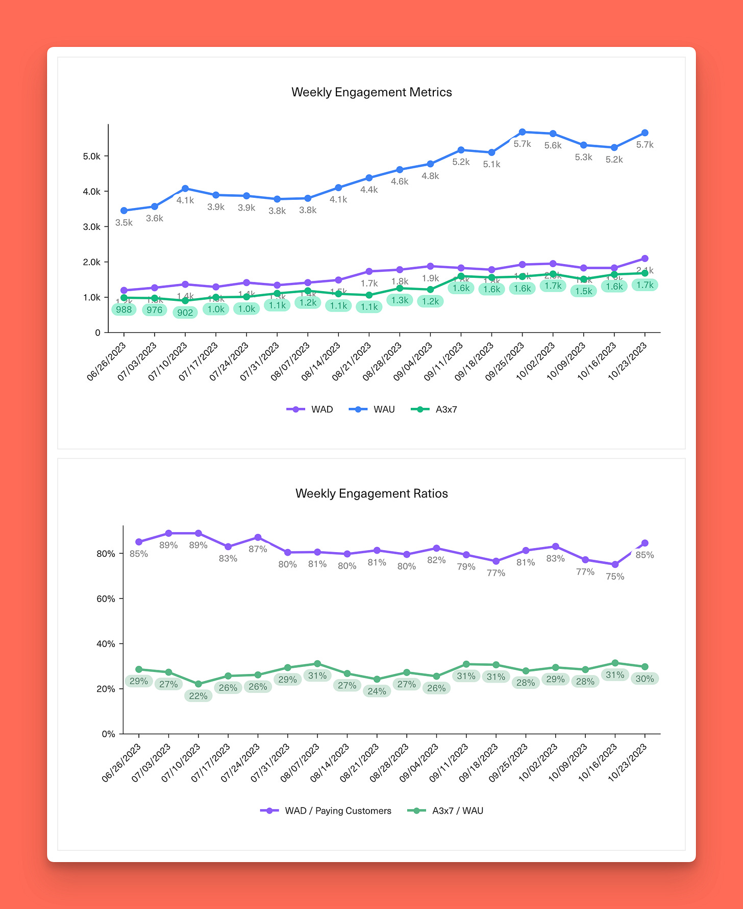
Classic metrics here include Monthly Active Users (MAU), Weekly Active Users (WAU), and Daily Active Users (DAU). Ratios between each give you an indication of the depth of engagement. David Sacks’s great writeup breaks down how to use each.
What does good look like? From David’s post:
Across all users at paid customers, a SaaS product with excellent engagement might have a DAU/WAU that crests at about 60% (3 workdays per week) and a DAU/MAU that crests about 40% (8 workdays per month).
As such, one of the metrics I love to look at, which we’ve used both at Intercom and now again at Equals, is A3x7. It’s a read on how many users are active in the product, 3 days out of 7 in a week. It’s a high bar for a SaaS product - excellent engagement, per David.
The more you can drive A3x7, the more you know you’ve deeply embedded yourself into your customer's workflow and become indispensable to them.
5. Operating Model
The Operating Model is what to use to determine who you can hire, when, and how much you can afford to pay them. It’s where you lay out your runway. It’s where you see how much longer you can go without fundraising, determine when you plan to fundraise again, and whether you’re on the trajectory necessary for a successful raise. In many ways, it’s the summation of all the work above. It’s where you plan the resources you need to act against all the indicators you see in your business - how you will operate.
Here are my general rules of thumb for planning for future financing needs:
As such, you want to plan your operating model to be in a place where you’re able to raise your next round with 12-18 months of runway:
The Runner-Ups
Other models that might be critical depending on the nature of your business include:
Return on Ad Spend / Unit Economics
Depending on the nature of how you acquire customers, this may be a critical set of analyses. If you spend on ads, you need to know if they’re profitable.
Customer Segmentation
If you sell a product that spans different buyers, business types, or company size, it is critical to understand your business by those segments. I find segmentation to be more of a lens you can apply to all of the reports and analyses shared above.
Cost of Goods Sold (COGS)
You might run a SaaS business that’s expensive to deploy and support. In that case, knowing how much you spend to provide your services to customers might be critical to how you scale.
Where to start?
There are always a million competing priorities within any startup. Defining these metrics and building analyses and reports based on them is hard (even if you’ve done it for 14 years, as I have).
We’re here to help
Amidst all the competing priorities, I’m excited today that we’re launching a new offering – Equals Experts.
With decades of collective experience working at companies including Atlassian, Stripe, and Intercom, our team of experts is ready and waiting to help you with model building, reporting automation, and custom implementation of Equals.
Everything I’ve shared above are things we’ve built for our customers - from ensuring the data is in the right state to getting the models set up and automated — we’re here to help. If that sounds interesting, we’d love to talk to you.


Amazing summary! Saved!