Finding position-market fit
In the search for product-market fit don't forget to find position-market fit.
As a startup, you're always evolving to find product-market fit. You’re constantly learning. You’re learning more about your target customers – what they want, what they need, and what appeals to them. And you’re learning more about the market you’re competing in – your competitors, where you win/lose vs. each, and their position in the market.
Feed those learnings into your positioning – every facet of it. Because if you’re not constantly iterating and tweaking your positioning, you’re either a marketing genius or missing the trick. Probably the latter. 😬
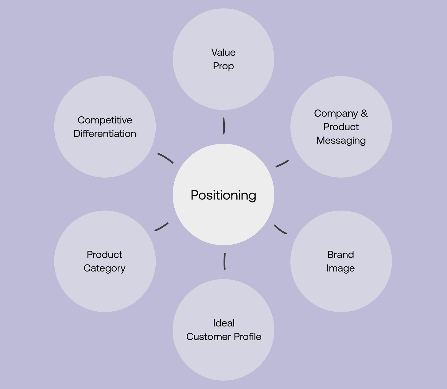
I might have made it up, but position-market fit is when you hold the right position in the minds of your target customers. It requires finding the right positioning for your company and product – finding because you should prepare for a lot of trial and error.
Your marketing site is critical here. It’s the touchpoint that will impact people’s perception of your company and your product the most. Before they even talk to you. Before they even use your product. And that’s why it needs to change at the same pace you’re learning.
Why we redesigned equals.com (again)
It was only last September that we overhauled our homepage.
A few months later, we shipped a family of new landing pages.
With this evolution of our marketing site came an evolution of our brand, which the team had only launched a couple of years prior. Ten months later, it’s evolved again.
Why? Three reasons.
1. Establish our (new) position in the market
Since the start, we have described Equals as the next-generation spreadsheet—one that worked just like those that came before but was fit for this era of work.
That all changed with the release of Equals 24—the biggest release since our first. It addressed some of the most pressing product feedback from our growing customer base, and feedback heard first-hand while navigating our idea map. Feedback we’ve fed back into our product messaging.
Still a spreadsheet at its core but not just a spreadsheet anymore
Equals 24 marked a new chapter. One that’s brought to life on our new marketing site.
In addition to evolving how we describe Equals and why you need it, we also needed to be much clearer about what you’d actually want to use it for.
2. Speak (more) clearly to what Equals is great for
Let’s face it: our first attempt at use cases didn’t quite hit the mark. Why? Well, they weren’t really use cases at all. Rather, they were jobs Equals could be hired for. In fact, that’s what we called the project internally. Upon reflection, it’s not surprising we landed where we did. 🙃
This was also due to our horizontal product and GTM strategy at the time. As Bobby puts it, “marketing a horizontal product is as hard as building one”. We’ve now verticalized our strategy. We’re far more deliberate about directing people towards specific use cases. Ones we know we serve well and are building pointed solutions for.
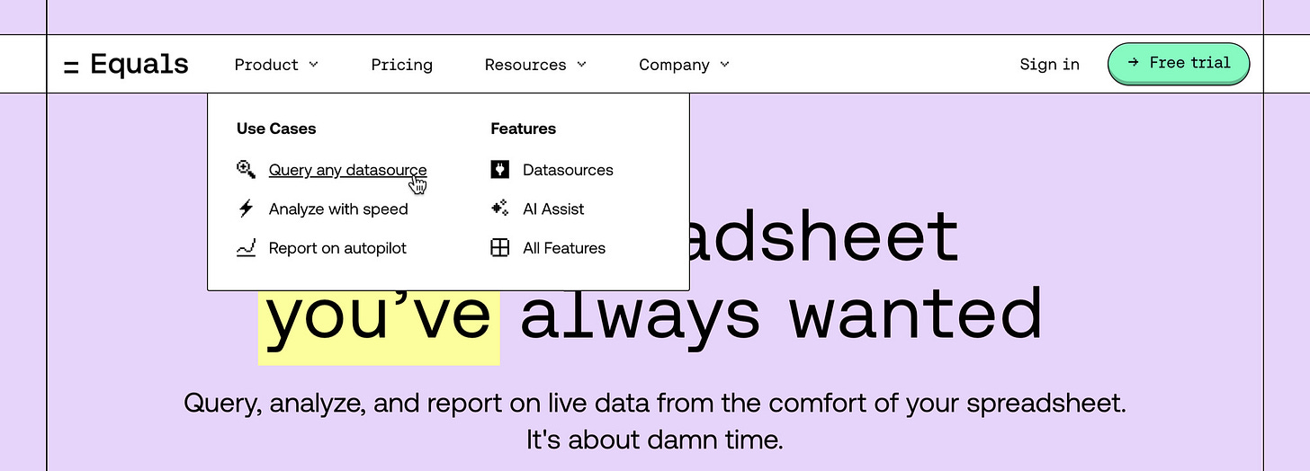
These use cases are now front and centre on our marketing site with new landing pages for ARR reporting, Sales funnel reporting, and SQL reporting. We’re building specific sales motions and tailored product experiences to cater to each. Heck, we’re even writing books about them.
But what about the jobs? They’re still there, but they're now showcased and better positioned as Features rather than Use cases.
For the keen eyes out there, you might have noticed some of the design updates in the two images above, which brings me to reason number three.
3. Elevate our brand to (better) appeal to ICPs
Last but certainly not least is our brand, specifically our brand image—how we want to look and how we want people to feel. We loved our original brand, but it felt a bit too consumer-y. We even used “too video game-like” when writing the project brief.
With this brand refresh lift, we wanted to look slightly more serious without losing the playfulness people had come to love. This is perhaps most apparent in our new palette and type–more muted pastels and more authoritative type styles.
And then there are our new icons.
That even made their way onto a box – a real one.
Brand work is always subjective, so I’ll leave it at that and let you form your own opinion after taking a look.
From how we describe Equals to how we illustrate what it’s great for to how it all looks and feels, this evolution of our positioning is just another stage on our journey to finding a position-market fit.
Did we hit the brief?
We want to extend a huge thank you to our friends at Super Keen, our partners on this really fun project.


Such a great writeup on some tactical advice to follow 💪